
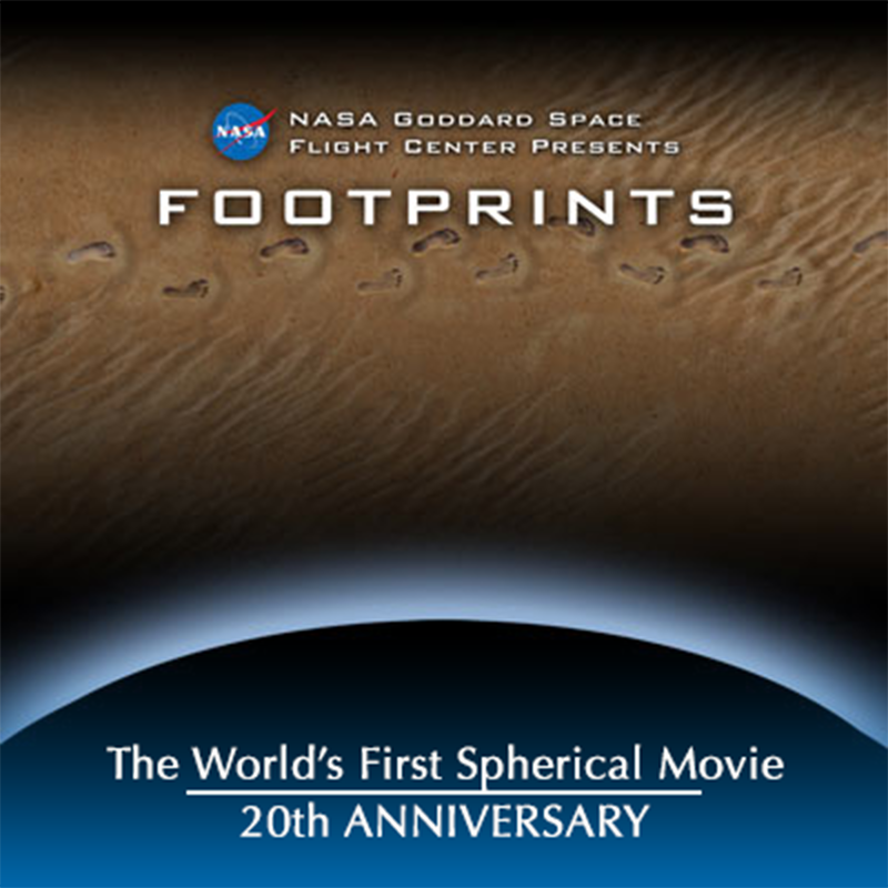
FOOTPRINTS holds the distinction of being the world’s first fully spherical film. It exists in the public domain, too, so if your local science museum has a sphere, you could ask them to load and play it for you!
This is the first of a two part series. The second installment drops on June 8, 2026.
May 4, 2026 marks the 20th anniversary of a movie that most of you have not seen. (But you still CAN if you know where to look!) Its inception came at a time seemingly just moments before the modern world got fully overwhelmed by 24/7 online stimulation. The content of the movie suggested a world of scientific possibility and promise, empowered by advanced technology and a desire to understand our place in the universe. It had a subtly romantic outlook, implicative of late night thoughts, propelled by a super-cool tango score. But the format of the movie—the actual, tangible shape and structure of the movie—made its own declaration, and in so doing, offered a new path for a wide range of artistic explorations.
In late 2005, the World Wide Web was barely into its own adolescence. Ubiquitous video delivered endlessly to everything had not yet wiped out everyone’s ability to hold their attention on something for more than thirty seconds. Your grandparents were not yet surfing Facebook and your kids were not yet slack-jawed in front of YouTube. No Instagram, no high-speed cellular downloads, no endless scrolls: in 2005 the world teetered on the edge of transformation.
In November of that year, I took a short trip to an unusual NOAA research lab in Boulder, Colorado. A tiny team of forward thinking data visualizers and computer engineers had developed some sort of new projection system, something to do with a curved screen. At the time, NOAA had only a quarter of NASA’s overall budget, and for a device that seemed adjacent to NOAA’s more traditional operations, this curious system sounded mysterious and unexpected.
When I got the assignment to go check out this weird thing, I was a media producer working for NASA’s Goddard Space Flight Center. Senior management had apparently seen a prototype a few months earlier and collaborated with NOAA to acquire one for the Goddard visitor center. The only problems was that nobody really knew what the system could do beyond show a small library of custom generated images. That didn’t make much sense to me. How different could this screen be from other screens, and why was there so little it could show?
I’ll never forget the moment I found out. When I walked into the NOAA lab where they’d hung their novel screen, I felt like I’d either stepped into a 1950’s sci-fi movie brought to life or the control room of a future science ministry. In the lab I encountered their screen hanging there in semi-darkness—not only curved, but a completely illuminated sphere. On it glowed a spectacular image of Earth’s moon, rotating in the void of their small black box theater. After about 30 seconds the image faded, replaced by a fully spherical depiction of the Earth, followed 30 seconds later by a similar depiction of Mars, each illumination using imagery gathered and stitched together from relatively recent observations captured from various spacecraft.
I was mesmerized. Suspended by thin, high tension cables camouflaged by shadows, the celestial spheres appeared to float above the floor, antigravity made real for a small catalogue of miniature planets.
“What’s it do?” I recall asking their assistant engineer.
“What do you mean ‘What does it do?’,” he said, somewhat taken aback. “That’s it! That’s what it does.”
The NOAA team had a name for their invention. They called it “Science On a Sphere”. (And for those of you thinking that I mistakenly capitalized the preposition in that name, I did not. That’s how NOAA officially coined it, and—alas--that’s been its official name ever since.)
For the next few hours we worked our way through the history and architecture and limited library of images available to the system. We discussed how the NOAA team made their images, how those images got to the screen, how the nerves and bones and muscles of the thing worked. A few pirated—and inevitable-- clips from sci-fi movies appeared, ripped from DVDs and plastered on the curved surface. Fun? Sure, but they were basically unwatchable, considering that the clips were silly-putty stretched, with parts of each image lost over the sphere’s horizon. Movie clips are natively rectangular, which meant they don’t easily conform to the geometry of a spherical screen.
In the most compelling sequence, I watched the Earth literally come to life in the form of a herky-jerky data visualization. The small, smart NOAA team had painstakingly built an animated sequence captured from data gathered by their primary workhorse weather satellites called GOES (Geostationary Operational Environmental Satellites). In the short video clip, an underlying still picture of the Earth appeared to rotate, while a geographically corresponding layer of clouds skidded across the planet’s surface. More than anything else, this presented a sort of living Earth, a dynamic planet that implied all of the many other forces that affect life here every day.
There were only a handful of animated sequences in total, most of them still showing rough edges from the digital workshop where they were created. One relied on some low resolution images of the sun’s dynamic surface. Another showed changes over time of global ocean surface temperatures.
I returned to NASA Goddard and reported what I saw. Considering that NASA knew a thing or two about planets, and that much of the data in the NOAA library came from NASA spacecraft, it seemed like a logical fit. The fact that there weren’t many images in the library overall didn’t seem to concern anyone, including myself. I was told that I could get a little support from Goddard’s extraordinary Scientific Visualization Studio to create a small handful of new planet pictures. I would mix the new material with the existing library, write a snappy set of talking points, figure out how to play it back, and that would be that.
Leadership wanted to debut this thing on May 4, 2006 for a major national conference of science teachers to be held at Goddard. Management informed me that The Sphere (as we started calling it) would be procured and installed sometime before the event. To my inevitable questions about needing access to a Sphere in order to learn how to use a Sphere, I simply got dismissive shrugs. “We don’t know when it will get here, so just do the best you can.”
That was annoying, but at the time it didn’t seem too significant. As little more than a slideshow playback system for fully spherical images, I figured the task would still be rather straight ahead. My slides, so to speak, would simply be spherical, based on planetary data. I’m match the text, then essentially click for the next slide.
December came with predictable year-end cookie exchanges and changes of pace and focus. I met briefly with members of the visualization lab, and also met a young video editor named Vicky Weeks who’d recently joined the production team. (Vicky makes a big appearance in Part II next month!) We kicked around some narrative ideas and discussed key technical matters, starting with an assessment of how we’d manage the 4K images the system used. Recall that in 2006, 4K images were highly unusual for mainstream media, testing even robust computers. The market had largely adopted high-definition TV screens by then, but not everyone could easily handle 4K, including our own media team. Each frame of 4K video contains roughly four times the amount of data as conventional HDTV, meaning a need for more speed, more memory, more storage, and, ultimately, more time.
But be that as it may, it wasn’t brain surgery. We managed to cobble together a working editing suite using second-hand parts and favors. We made preliminary plans and set up a rough production schedule. After that, the visualization team, Vicky, our NASA managers, and I took some time off for the holidays and throttled down our collective engines.
Ideas are funny things. They do not always show up on time, and they often don’t show up when it’s convenient either. I vividly recall the moment to this day: sometime in the middle of the holiday week, late at night, a simple thought came to mind. The moment the idea crystalized, it released something new and thrilling, effectively setting off a cascade of events and discoveries. Here’s the gist of it, condensed:
Traditional movies and videos don’t fit onto The Sphere because they are not naturally spherical. They come from cameras that see the world in rectangular frames. What if we constructed a visual vocabulary for presenting narratives inside a fully spherical frame? What if we made our movies to be natively….spherical? If we could, that would free us from being tied exclusively to natively spherical subjects, like planets or beach balls. But to do this, we would need to reconsider many of the basic rules--compositional and technical--that have shaped framed visual depictions for centuries.
Sounds kind of grand, right? The statement is almost laughably inflated, bordering on pretentious. The funny thing, however, is that it’s largely true. Here’s a simple thought experiment to emphasize the point. You know the camera on your phone? It shoots a rectangular image. Where possibly could we get images of the real world that were natively spherical if the vast majority of all cameras in existence captured rectangular images?
Ideas can be funny in another way, too. Just because an idea comes to mind doesn’t necessarily mean an equally clear path appears to bring it to life. In this case, the idea exerted itself with a powerful grip, and in the remaining days of Winter break, and then into the first few weeks of the new year, our small team began to define a methodology that would lead to the emergence of something new.
In the second half of this story, I’ll get into what we discovered, how we tackled the challenge, and what we ultimately developed. That’s next month—June 8, 2026. See you then!