
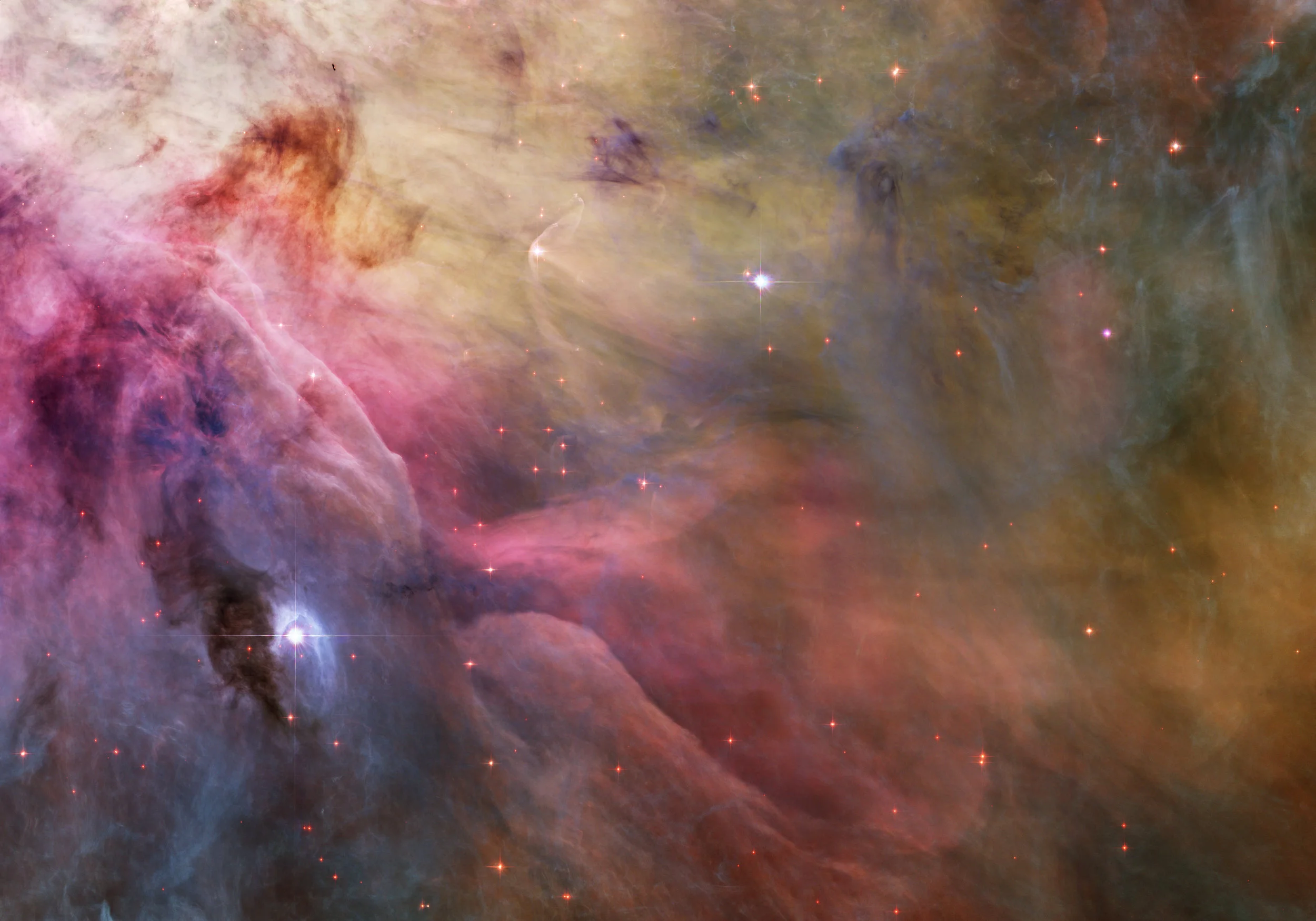
This nebula, The Orion, exists, but it doesn't really look like this. If that's true, how can we call this a valid, scientifically accurate image? (That's the point of today's blog.)
That’s not what a nebula looks like. Nobody’s ever seen a nebula with their own eyes, unaided by some sort of instrument.
It sure is beautiful, though. There must be countless computer desktops and dorm room posters and Discovery Channel documentaries displaying images just like it precisely because they’re so attractive and, for many, inspirational.
The term of art for manipulated palettes like this is “false color”, but to those making color selections like the ones used in the picture, the hues are most certainly true. Someone will inevitably say—and he or she won’t be wrong—that well designed false color palettes have a practical purpose, namely to define aspects of a data set that might otherwise elude our attention. For example, satellite images of forests can be calibrated to show hot spots as red pixels, suggesting places where fire management officials ought to focus their attention. But a more nuanced reading of this process suggests something deeper. While false color representations of data can provide vital insights that might otherwise disappear into a sea of peripheral noise, many false color charts exist primarily because visualizers are making aesthetic choices.
Science meets subjectivity. Now we enter the ancient woods and look around in wonder.
There’s nothing wrong with relying on instrumentation or computer code to interpret information for us. When we fly in airplanes, most of the data flooding cockpits come from sensors interpreting otherwise intangible measurements. Pilots rely on these intangible bits of information. Same goes for every blood test in a modern lab, or every intra-day trading chart for a commodity on the stock market. We can’t count on our senses to understand the world because our senses can’t actually perceive most of the world. Cognition, however, is something synthetic. Where our senses fail us, our ability to understand translated information soars. False color offers one way for us to supplement what our senses cannot perceive in order for us to appreciate something that nonetheless exists.
The Hubble Space Telescope collects visible light among other data, but the images it generates are mostly a function of smart art direction on the part of a great team at The Space Telescope Science Institute. We have a visual sense of the universe because a group of humans interpreted what our machines collected.
Think of it this way. When J.S. Bach published The Goldberg Variations in 1741, humanity received what could arguably be considered source data. There on the sheet music are definable, quantifiable notes, a map to the music the master intended with his original quill. It was performed for centuries after it first appeared, and then musicians began recording it regularly once the requisite technologies emerged. Then in 1955 a Canadian piano virtuoso named Glenn Gould sat down at a piano in New York and recorded his version of The Goldbergs. He read the data a little differently than others who came before, so to speak, and the world changed. Many extraordinary pianists have played the Goldberg Variations since 1955, but Gould’s performance continues to be held up as one of the great recordings—of any piece of music, in any genre—of all time.
We should not pretend otherwise: music demands interpretation while science has different goals. The arts and the sciences are not the same, even if they share essential traits. But also we should not be naive. Science is about information, and information only matters if it makes sense. The moment humans get involved in interpreting information, they get their fingerprints all over it. Even the most extraordinary collections of data captured by dispassionate observatories encounter subjective forces. While we may be able to quantify certain aspects, say if a wavelength of light shifts toward the red side or blue side of the spectrum, the presentation of that data often depends on subjective decisions.
Are there some aspects of data that are not in dispute? I hope so! We all must agree what constitutes certain baseline realities, or else risk a thicket of subjective relativism that shreds rationality. Water’s boiling point at sea level is not open to interpretation. But where all but three of the Goldberg Variations are in the key of G Major (an objective reality defined by the original score), the listener hears the music only after it’s passed through the fingers of the player. The same goes for images created with our scientific instruments. False color palettes can be poorly selected just like music can be poorly played. But false color palettes designed to reveal inner truths about data collected by a particular instrument may ultimately be a commentary that reveals innate aspects of our own humanity, shining in a sea of stars.